The Brief
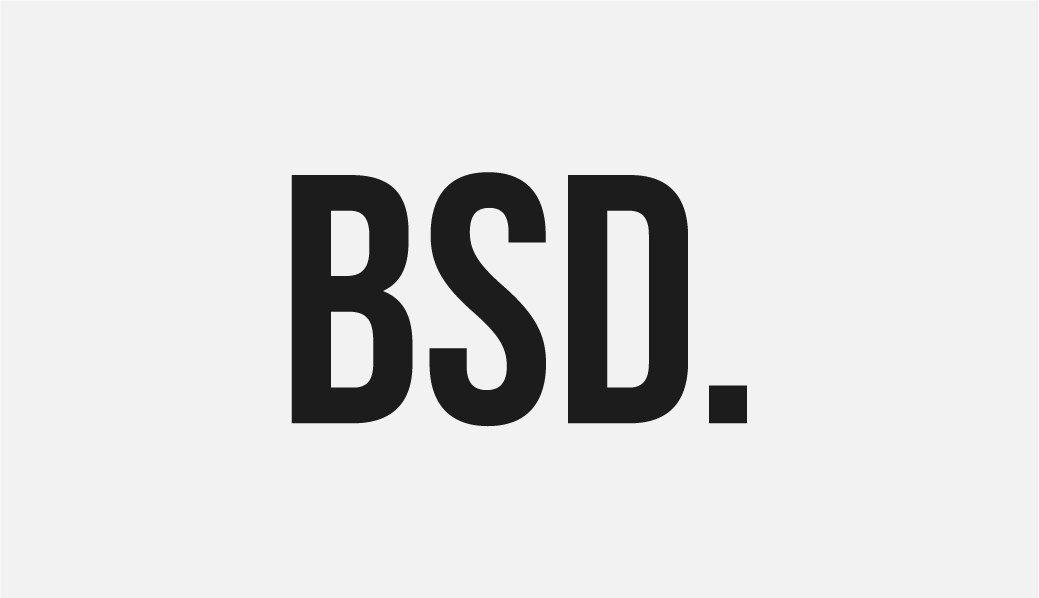
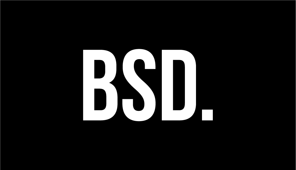
I redesigned the Bit Space Development logo when I started my position at the company as the Creative Director. The CEO wanted to change the previous logo to something shorter and easy to remember. After going through some logo ideas, he preferred to use a wordmark logo instead.
I chose a bold and modern font to compliment the company's mission statement. As for the dot at the end of Bit Space Development, it symbolizes the word 'Bit' where, in the binary world is a basic unit of information in computing.

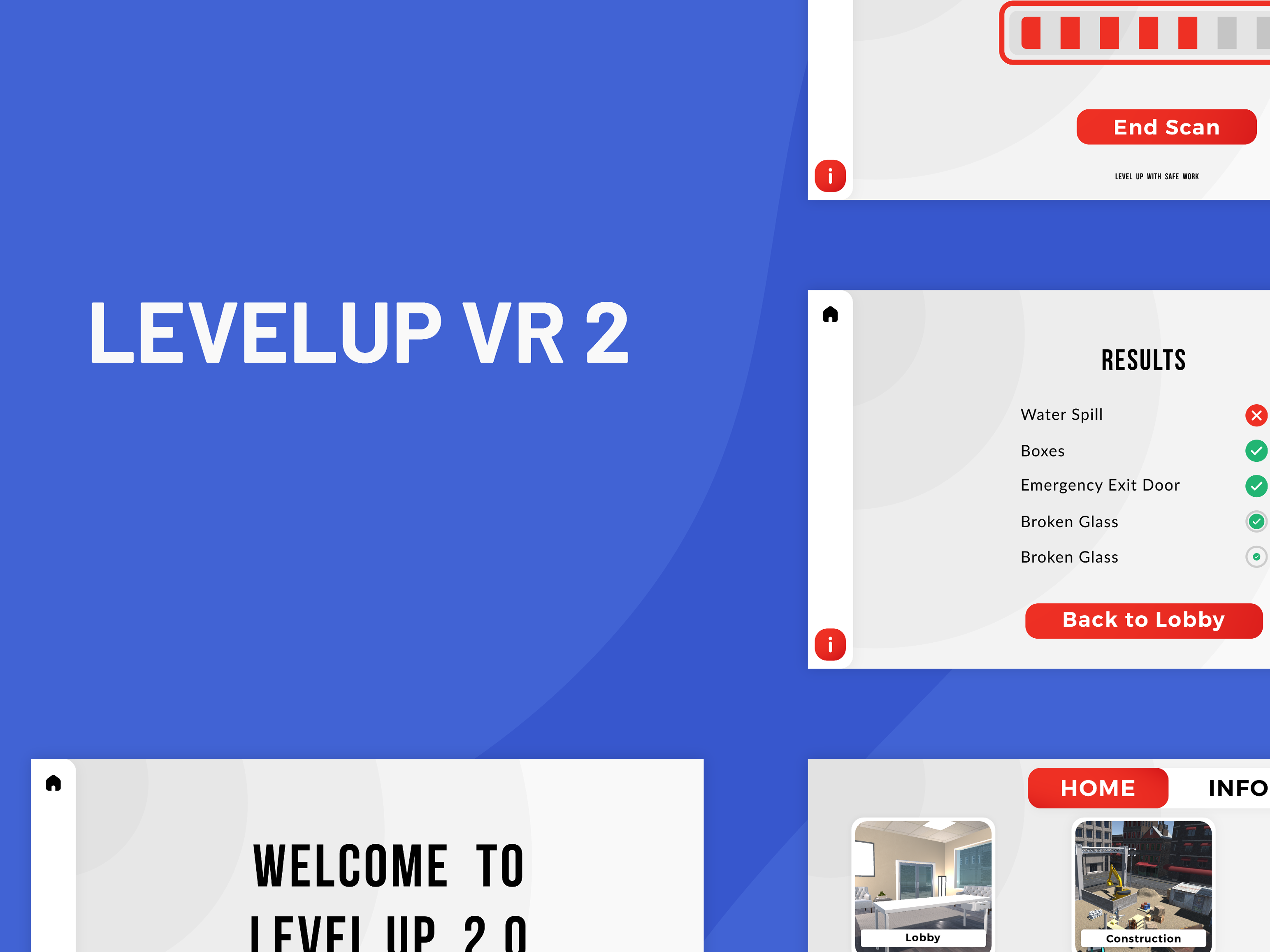
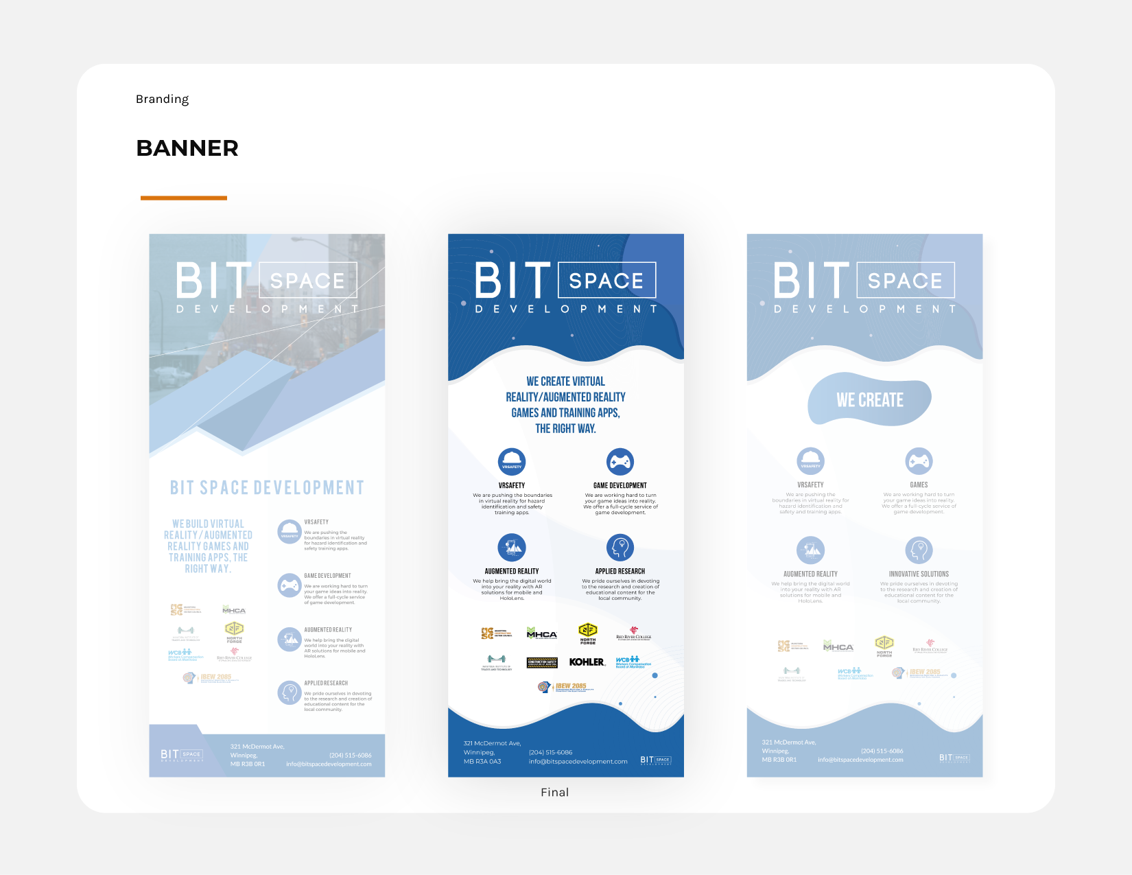
Marketing Material
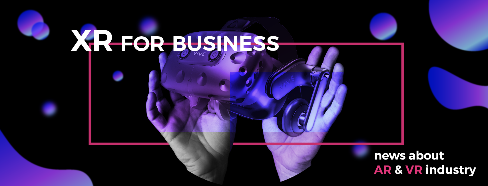
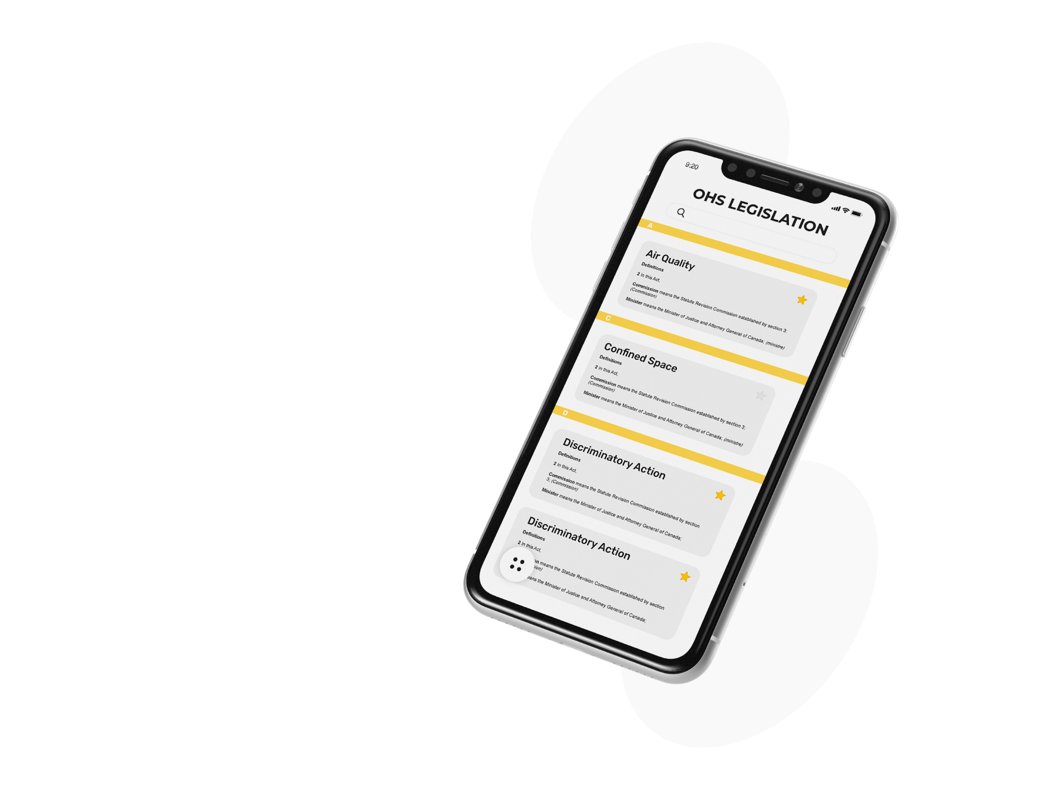
When I joined the company, one of the items for me to tackle on my list was to make a new banner for trade shows. The first iteration of the banner made use of angular shapes which seemed too aggressive, cold and uninviting.
To remedy this issue, I opted to use organic shapes and a blue colour scheme to denote feelings of trust, security, order, and cleanliness. To fill in the empty spaces, I chose to use contour lines along with shapes with different hues of the main colour.
*The logo had yet to be redesigned when the banner was made.
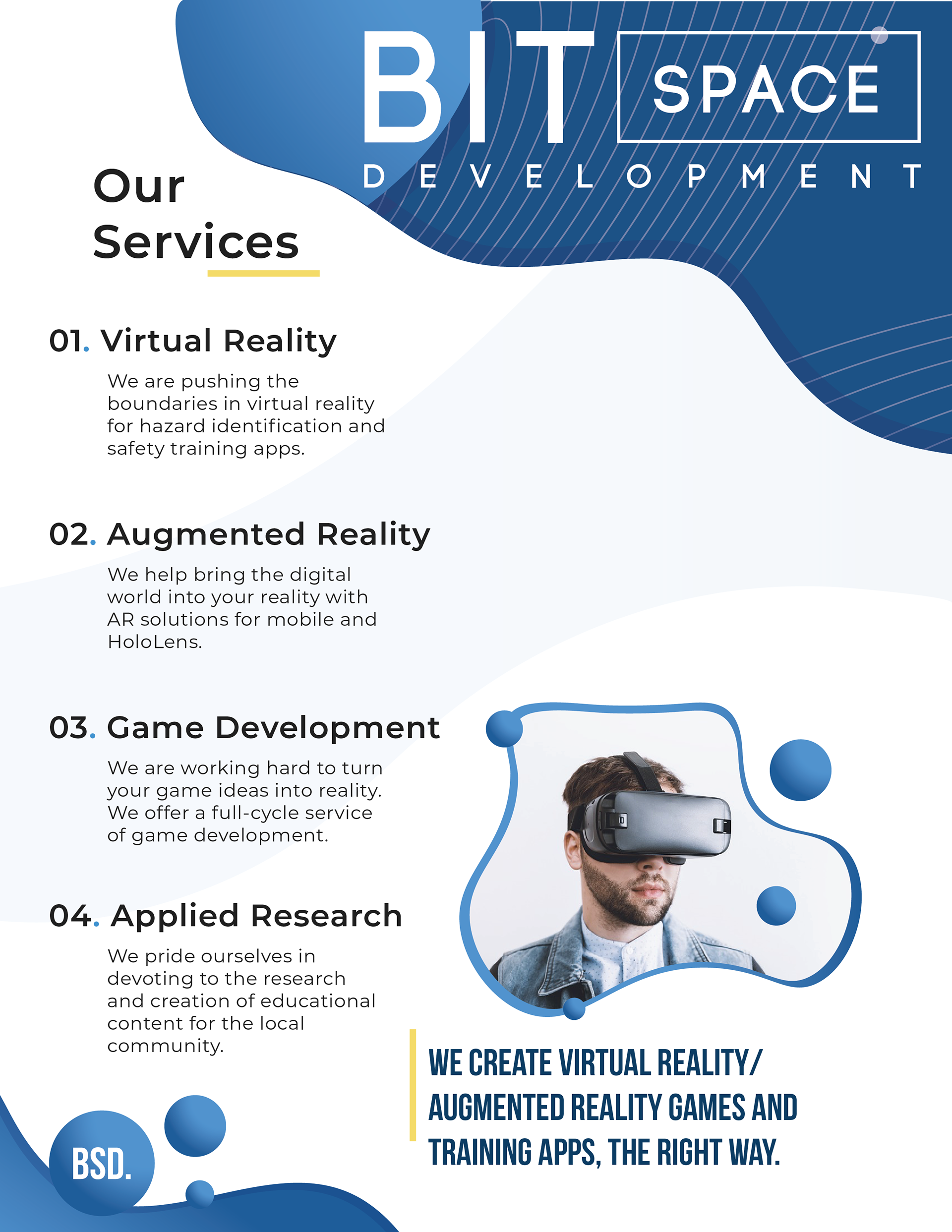
Handout
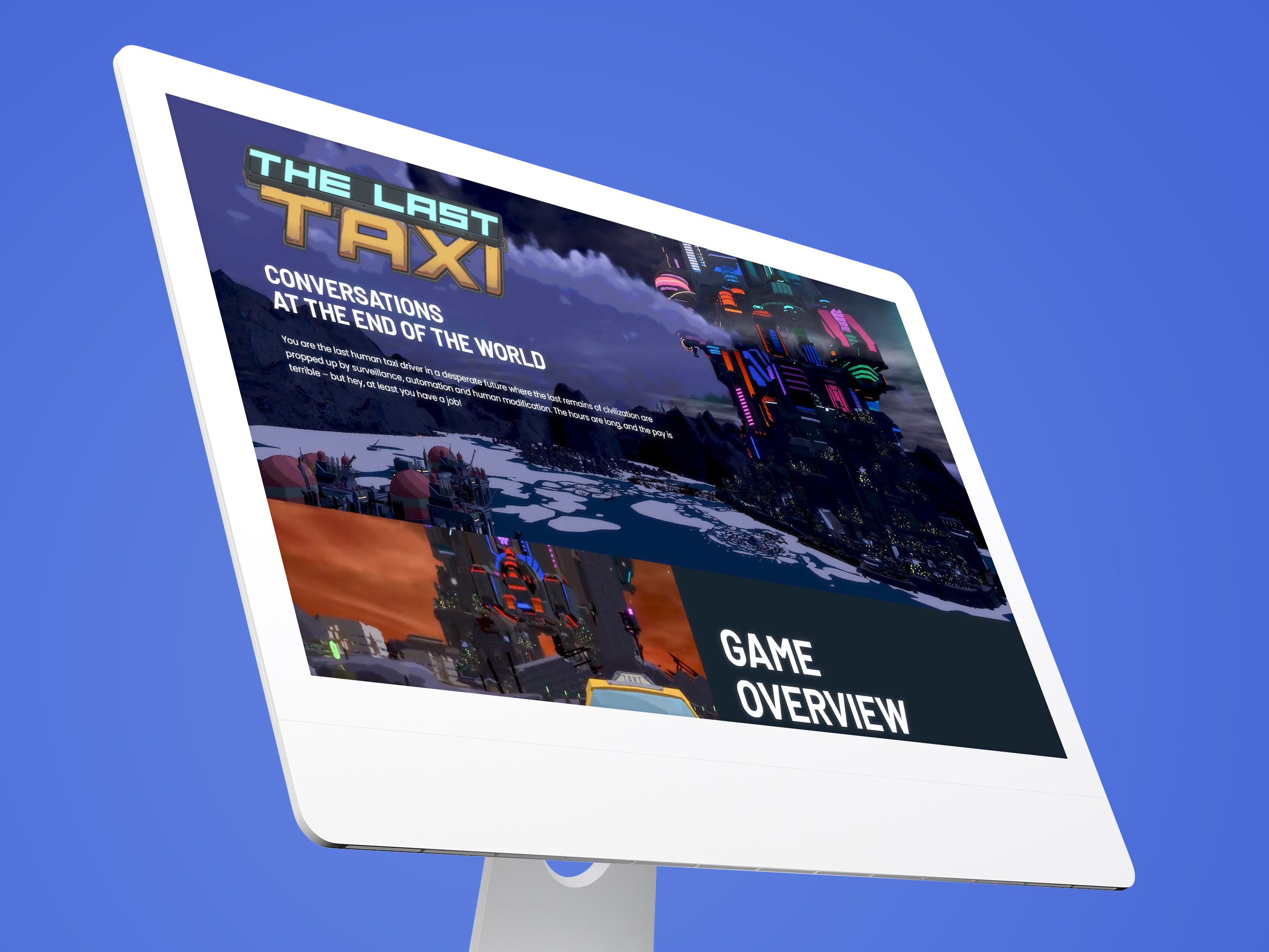
Social Media Platform Banner