The Brief
The Link: Youth and Family Supports (formerly Macdonald Youth Services) is a social services organization located in Winnipeg, MB. They work with youths and families to nurture strong connections, independence and to improve physical, mental and emotional wellness.
I was tasked with rebranding Macdonald Youth Services as The Link to give it a fresh start.
Branding
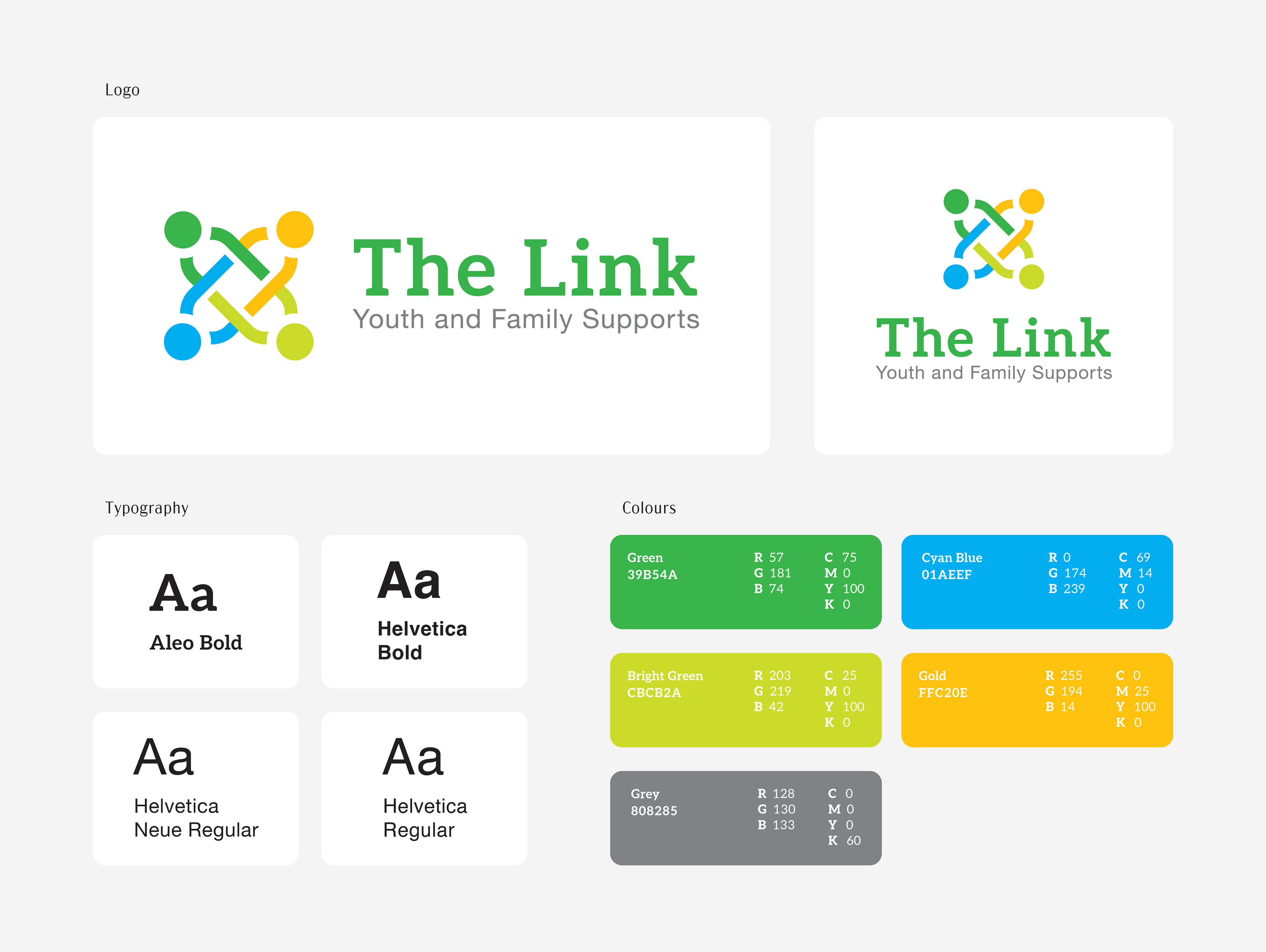
I was given a lot of creative freedom with the creation of The Link's brand identity. They wanted a clean new beginning, which I reflected with a spring-based colour story that would be reminiscent of new growth.
In regard to the font choices, the client wanted something with a welcoming, contemporary feel. I stayed clear of corporate and traditional serif styles, opting for bold and confident shapes.
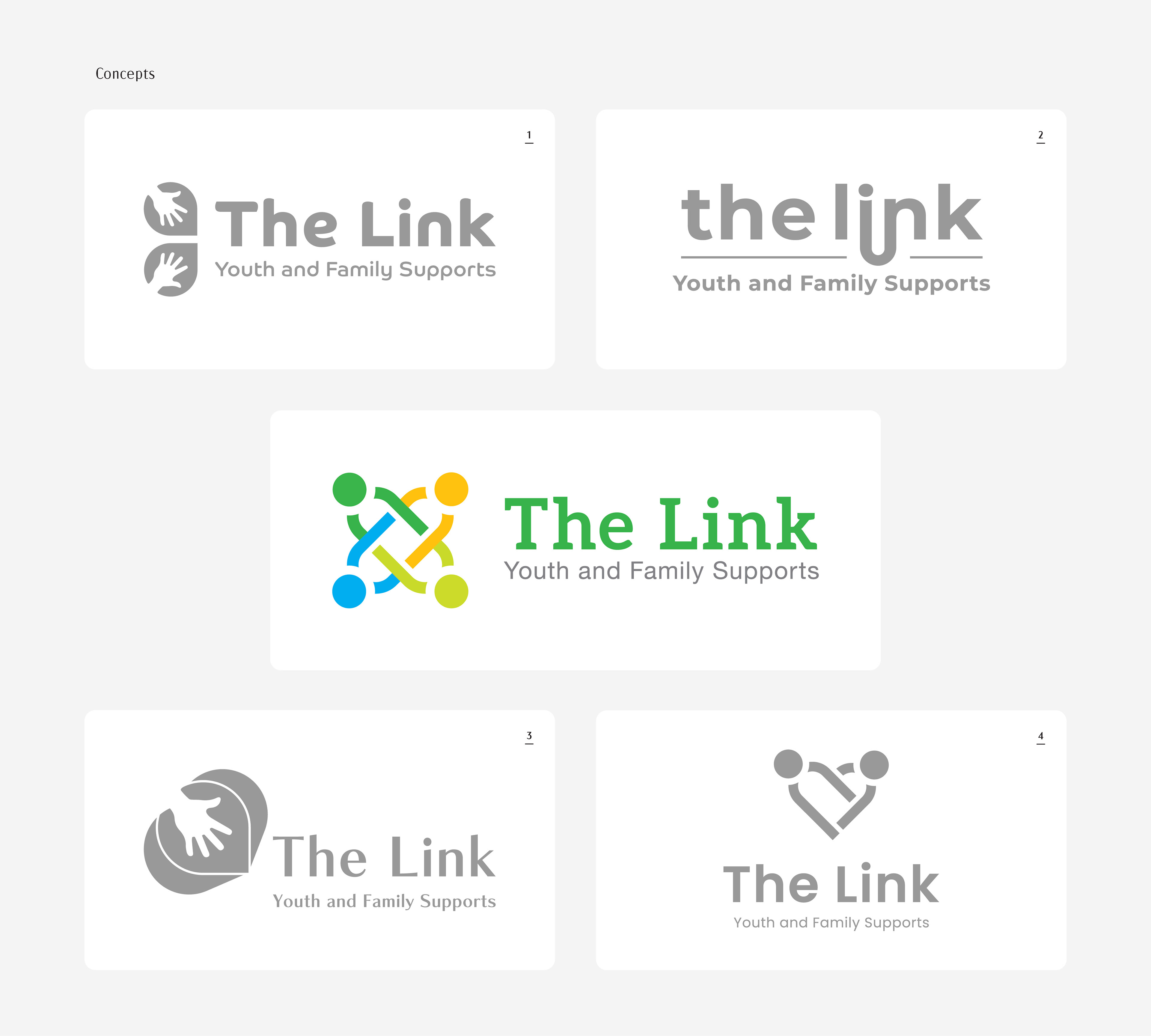
Logo Concepts
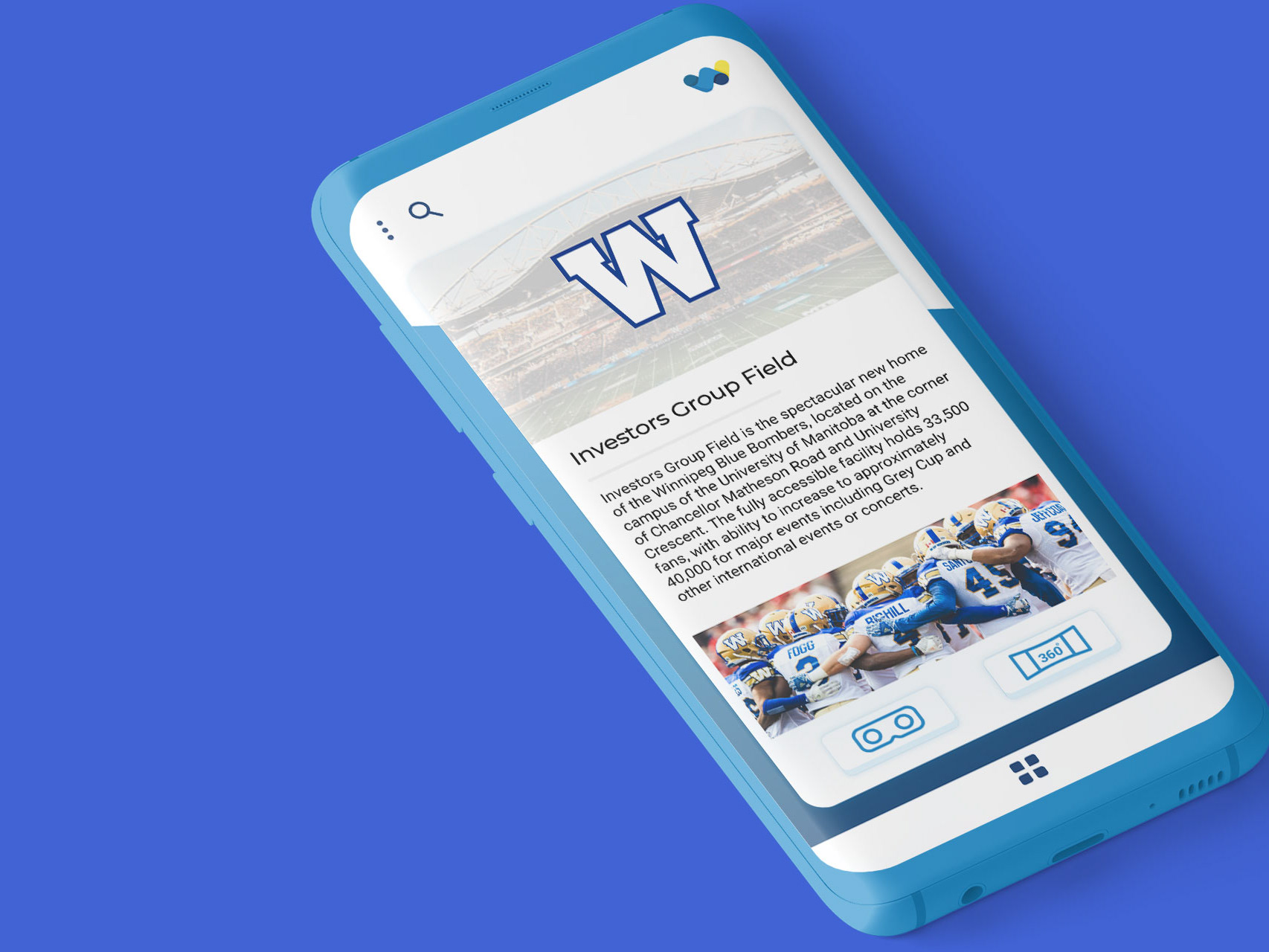
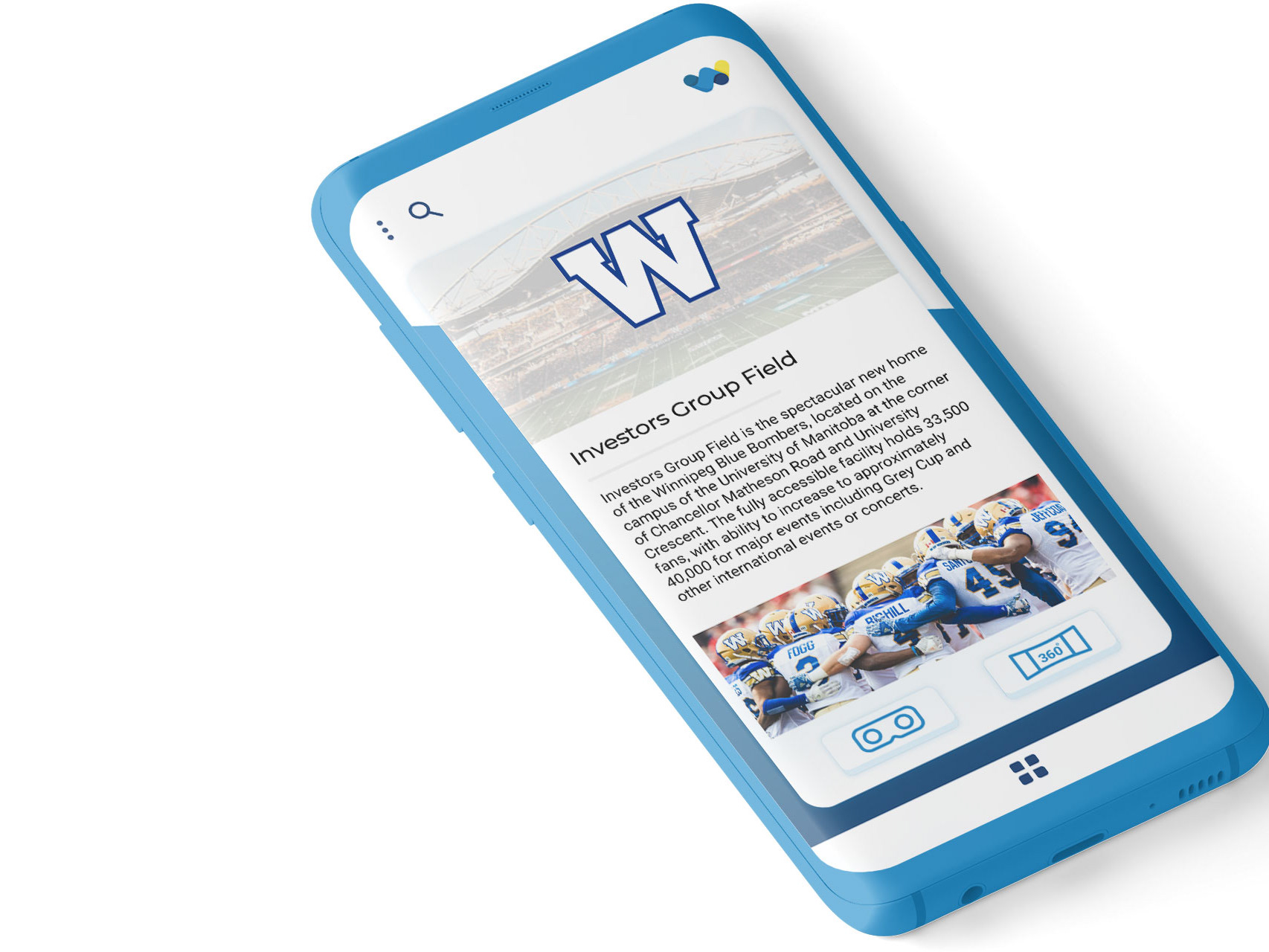
The client wanted their logo to evoke human connection, unity, and safety.
In the chosen logo, I wanted to reference a childhood game where we would spin in circles with our hands crossed and linked in the centre. In the logo, the four circles are the heads of the children and their crossed arms create links of a chain.